---
url: /3.x-beta/guide/getting-started/overview.md
---
# Overview
This is the v3 beta documentation. The default stable documentation remains 2.x until v3 is released as stable.
Have you ever struggled with implementing complex gesture handling and animations when building image galleries or content viewers in React Native?
Existing libraries often have limited customization options or performance issues. `react-native-gesture-image-viewer` is a high-performance **universal gesture viewer** library built on [**React Native Reanimated**](https://docs.swmansion.com/react-native-reanimated/) and [**Gesture Handler**](https://docs.swmansion.com/react-native-gesture-handler/docs/), providing complete customization and intuitive gesture support for not only images but also videos, custom components, and any other content.
## How v3 Paging Works
Version 3 no longer depends on a consumer-provided `ScrollView`, `FlatList`, or `FlashList` for paging. `GestureViewer` owns horizontal paging internally with a gesture-driven render window.
`windowSize` controls the size of the render window kept around the current item and defaults to `3`. With the default setting, the viewer mounts the previous, current, and next pages. In non-loop mode, pages outside the data range are omitted at the boundaries.
During an animated page change, Reanimated moves the existing pages first. After the transition finishes, the viewer updates the render window around the new current item. Pages that remain inside the window stay mounted, the page leaving the window unmounts, and the newly adjacent page mounts.
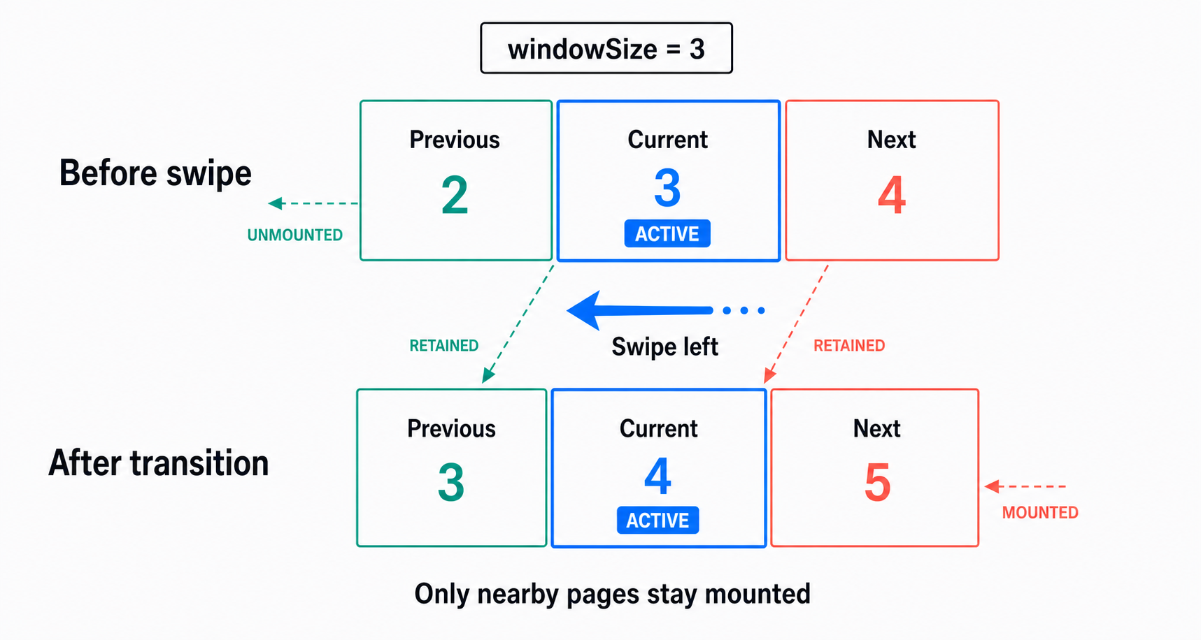
When `enableLoop` is enabled, the internal render window wraps from the last item to the first and from the first item to the last. This behavior also does not rely on a list implementation.
Use `windowSize` only when you need more adjacent content mounted, and use `pageSpacing` when you need visible space between pages.
## Key Features
- 🤌 **Complete Gesture Support** - Pinch zoom, double-tap zoom, swipe navigation, pan when zoomed-in, and vertical drag to dismiss
- 🏎️ **High-Performance Animations** - Smooth and responsive animations at 60fps and beyond, powered by React Native Reanimated
- 🪟 **List-Free Render Window** - Internal gesture-owned paging without requiring `ScrollView`, `FlatList`, or `FlashList`
- 🎨 **Full Customization** - Total control over components, styles, and gesture behavior
- 🎛️ **External Control API** - Trigger actions programmatically from buttons or other UI components
- 🧩 **Multi-Instance Management** - Manage multiple viewers independently using unique IDs
- 🧬 **Flexible Integration** - Use with Modal, [React Native Modal](https://www.npmjs.com/package/react-native-modal), [Expo Image](https://www.npmjs.com/package/expo-image), [FastImage](https://github.com/DylanVann/react-native-fast-image), and custom content
- 🧠 **Full TypeScript Support** - Great developer experience with type inference and safety
- 🌐 **Cross-Platform Support** - Runs on iOS, Android, and Web with Expo Go and New Architecture compatibility
- 🪄 **Easy-to-Use API** - Simple and intuitive API that requires minimal setup
---
url: /3.x-beta/guide/getting-started/installation.md
---
# Installation
:::warning React Native Reanimated v3 Users
If you're using **React Native Reanimated v3**, **version 1.x** of this library is recommended for the best experience.
👉 **[Go to v1.x Documentation](/1.x/guide/getting-started/installation.md)**
Version 3.x supports React Native Reanimated v4.
:::
:::info Important
`react-native-gesture-image-viewer` is a high-performance viewer library built on [`react-native-reanimated`](https://www.npmjs.com/package/react-native-reanimated) and [`react-native-gesture-handler`](https://www.npmjs.com/package/react-native-gesture-handler).
Therefore, you **must install** React Native Reanimated and Gesture Handler before using this library. Please refer to the official documentation of these libraries for detailed setup guides.
:::
#### Minimum Requirements
| Library | Minimum Version |
| :----------------------------- | :-------------: |
| `react` | `>=18.0.0` |
| `react-native` | `>=0.75.0` |
| `react-native-gesture-handler` | `>=2.24.0` |
| `react-native-reanimated` | `>=4.0.0` |
| `react-native-worklets` | `>=0.5.0` |
## [React Native Reanimated Setup](https://docs.swmansion.com/react-native-reanimated/docs/fundamentals/getting-started/)
### Install `react-native-reanimated` and `react-native-worklets` packages:
```sh [npm]
npm install react-native-reanimated
```
```sh [yarn]
yarn add react-native-reanimated
```
```sh [pnpm]
pnpm add react-native-reanimated
```
```sh [bun]
bun add react-native-reanimated
```
```sh [deno]
deno add npm:react-native-reanimated
```
- `react-native-worklets` was separated from `react-native-reanimated` for better modularity and must be installed separately.
```sh [npm]
npm install react-native-worklets
```
```sh [yarn]
yarn add react-native-worklets
```
```sh [pnpm]
pnpm add react-native-worklets
```
```sh [bun]
bun add react-native-worklets
```
```sh [deno]
deno add npm:react-native-worklets
```
### Configure Babel
#### Expo
:::warning Expo Go Support
To use Reanimated 4 in Expo Go environment, you need to use [Expo SDK 54(beta)](https://expo.dev/go).
:::
Run prebuild to update the native code in the ios and android directories.
```sh [npm]
npm expo prebuild
```
```sh [yarn]
yarn expo prebuild
```
```sh [pnpm]
pnpm expo prebuild
```
```sh [bun]
bun expo prebuild
```
```sh [deno]
deno expo npm:prebuild
```
And that's it! Reanimated 4 is now configured in your Expo project.
Since Expo SDK 50, the Expo starter template includes the Reanimated babel plugin by default.
#### React Native CLI
When using React Native Community CLI, you also need to manually add the `react-native-worklets/plugin` plugin to your `babel.config.js`.
```js title="babel.config.js"
module.exports = {
presets: [
... // don't add it here :)
],
plugins: [
...
// for web
'@babel/plugin-transform-export-namespace-from', // [!code highlight]
// react-native-worklets/plugin has to be listed last.
'react-native-worklets/plugin', // [!code highlight]
],
};
```
## [React Native Gesture Handler Setup](https://docs.swmansion.com/react-native-gesture-handler/docs/fundamentals/installation)
```sh [npm]
npm install react-native-gesture-handler
```
```sh [yarn]
yarn add react-native-gesture-handler
```
```sh [pnpm]
pnpm add react-native-gesture-handler
```
```sh [bun]
bun add react-native-gesture-handler
```
```sh [deno]
deno add npm:react-native-gesture-handler
```
- `react-native-gesture-handler` generally doesn't require additional setup, but please refer to the official documentation for your specific environment.
- For [using gestures in Android modals](https://docs.swmansion.com/react-native-gesture-handler/docs/fundamentals/installation#android), you would normally need to wrap modal content with `GestureHandlerRootView`. However, **this library already includes `GestureHandlerRootView` internally, so no additional wrapping is needed when using modals.**
## Install React Native Gesture Image Viewer
You’re all set! 🎉
Start by installing the beta release of `react-native-gesture-image-viewer`
```sh [npm]
npm install react-native-gesture-image-viewer@beta
```
```sh [yarn]
yarn add react-native-gesture-image-viewer@beta
```
```sh [pnpm]
pnpm add react-native-gesture-image-viewer@beta
```
```sh [bun]
bun add react-native-gesture-image-viewer@beta
```
```sh [deno]
deno add npm:react-native-gesture-image-viewer@beta
```
---
url: /3.x-beta/guide/getting-started/quick-start.md
---
# Quick Start
## Examples & Demo
- [📁 Example Project](https://github.com/saseungmin/react-native-gesture-image-viewer/tree/main/example) - Real implementation code with various use cases
- [🤖 Expo Go](https://snack.expo.dev/@harang/react-native-gesture-image-viewer-v3) - Try it instantly on Expo Snack
## Installation
:::warning Important
`react-native-gesture-image-viewer` is a high-performance viewer library built on [`react-native-reanimated`](https://www.npmjs.com/package/react-native-reanimated) and [`react-native-gesture-handler`](https://www.npmjs.com/package/react-native-gesture-handler).
Therefore, you **must install** React Native Reanimated and Gesture Handler before using this library. **If you haven't set it up yet, please refer to the [installation guide](/3.x-beta/guide/getting-started/installation.md).**
:::
```sh [npm]
npm install react-native-gesture-image-viewer@beta
```
```sh [yarn]
yarn add react-native-gesture-image-viewer@beta
```
```sh [pnpm]
pnpm add react-native-gesture-image-viewer@beta
```
```sh [bun]
bun add react-native-gesture-image-viewer@beta
```
```sh [deno]
deno add npm:react-native-gesture-image-viewer@beta
```
## Basic Usage
`react-native-gesture-image-viewer` is a library focused purely on gesture interactions for complete customization.
```tsx
import { useCallback, useState } from 'react';
import { Image, Modal, View, Text, Button, Pressable } from 'react-native';
import {
GestureViewer,
GestureTrigger,
useGestureViewerController,
useGestureViewerEvent,
useGestureViewerState,
} from 'react-native-gesture-image-viewer';
function App() {
const images = [...];
const [visible, setVisible] = useState(false);
const [selectedIndex, setSelectedIndex] = useState(0);
const { goToIndex, goToPrevious, goToNext } = useGestureViewerController();
const { currentIndex, totalCount } = useGestureViewerState();
const openModal = (index: number) => {
setSelectedIndex(index);
setVisible(true);
};
const renderImage = useCallback((imageUrl: string) => {
return ;
}, []);
useGestureViewerEvent('zoomChange', (data) => {
console.log(`Zoom changed from ${data.previousScale} to ${data.scale}`);
});
return (
{images.map((uri, index) => (
openModal(index)}>
))}
setVisible(false)}
/>
);
}
```
---
url: /3.x-beta/guide/getting-started/ai.md
---
# AI
To help AI better understand this library's features, versioned documentation, and project conventions so it can provide more accurate help during development and troubleshooting, this project provides the following capabilities:
## llms.txt
[`llms.txt`](https://llmstxt.org/) helps LLMs discover and use project documentation. This site publishes the following files.
- [llms.txt](https://react-native-gesture-image-viewer.pages.dev/3.x-beta/llms.txt): The structured index file for the `3.x-beta` docs.
```txt
https://react-native-gesture-image-viewer.pages.dev/3.x-beta/llms.txt
```
- [llms-full.txt](https://react-native-gesture-image-viewer.pages.dev/3.x-beta/llms-full.txt): The full-content file that concatenates the complete `3.x-beta` documentation into a single file.
```txt
https://react-native-gesture-image-viewer.pages.dev/3.x-beta/llms-full.txt
```
Choose the file that best fits your use case:
- `llms.txt` is smaller and consumes fewer tokens, so it works well when AI should fetch specific pages on demand.
- `llms-full.txt` contains the complete documentation for the current version, so AI does not need to follow individual links. This is useful for broader understanding or larger refactors, but it consumes more tokens.
## Markdown docs
Every documentation page also has a corresponding Markdown version that can be passed directly to AI.
Examples:
```txt
https://react-native-gesture-image-viewer.pages.dev/3.x-beta/guide/getting-started/overview.md
https://react-native-gesture-image-viewer.pages.dev/3.x-beta/guide/getting-started/quick-start.md
https://react-native-gesture-image-viewer.pages.dev/3.x-beta/guide/usage/programmatic-control.md
```
Providing a single Markdown page is often the most efficient option when you want help with one specific feature.
---
url: /3.x-beta/guide/migration-from-2.x.md
---
# Migrating from 2.x to 3.x
Version 3 removes the consumer-supplied list paging layer. `GestureViewer` now owns its paging with an internal gesture-driven render window, so apps no longer need to pass `ScrollView`, `FlatList`, or `FlashList` into the viewer.
## Migration Steps
### Remove list component props
Delete `ListComponent` and `listProps` from `GestureViewer`.
```diff
item.id,
- }}
/>
```
### Replace snap spacing with page spacing
`enableSnapMode` and `itemSpacing` have been removed. Use `pageSpacing` when you need visible space between pages.
```diff
```
### Tune the render window only when needed
By default, v3 mounts three pages: previous, current, and next. Increase `windowSize` only when you need more adjacent content mounted.
```tsx
```
### Keep programmatic navigation
`goToIndex`, `goToPrevious`, and `goToNext` still work. `horizontalSwipe={{ enabled: false }}` disables only user/mouse horizontal swipe gestures; controller navigation and autoplay remain available.
```diff
```
```tsx
const { goToIndex } = useGestureViewerController();
goToIndex(2);
goToIndex(2, { animated: false });
```
## Removed Props
| 2.x prop | 3.x replacement |
| ---------------- | ---------------------------------------------------- |
| `ListComponent` | Removed. Paging is internal. |
| `listProps` | Removed. Use `renderItem` for content customization. |
| `enableSnapMode` | Removed. Internal paging is always gesture-driven. |
| `itemSpacing` | `pageSpacing` |
## Common `listProps` Migrations
v3 no longer forwards props to `ScrollView`, `FlatList`, or `FlashList`. Move common `listProps` usage to the v3 viewer APIs instead:
| 2.x `listProps` usage | v3 direction |
| ------------------------------------------------------------------------------------ | ----------------------------------------------------------------------------------------------------------------------------------------- |
| `keyExtractor` | Removed. The render window owns slot keys; keep stable item identity in `data` and render content through `renderItem`. |
| `initialScrollIndex` | Use `initialIndex`. |
| `scrollEnabled`, `pagingEnabled`, `horizontal`, `snapToInterval`, `decelerationRate` | Removed. Paging is gesture-owned. Use `horizontalSwipe={{ enabled: false }}` to lock user swipes and `pageSpacing` for visible page gaps. |
| `onScroll`, `onMomentumScrollEnd`, `onViewableItemsChanged` | Removed. Use `useGestureViewerState` for `currentIndex`/`totalCount`; use viewer events for supported viewer interactions. |
| `ref.current.scrollToIndex(...)` | Use `useGestureViewerController().goToIndex(...)`, `goToNext()`, or `goToPrevious()`. |
| `windowSize`, `maxToRenderPerBatch`, `removeClippedSubviews`, `estimatedItemSize` | Replace list virtualization tuning with `windowSize`. The default mounts previous/current/next only. |
| `showsHorizontalScrollIndicator`, `contentContainerStyle`, list separators | Removed. Compose visual content inside `renderItem` or use `pageSpacing` for inter-page gaps. |
## Notes
- `renderItem` remains the customization point for images, videos, and custom content.
- `useGestureViewerState` continues to expose `currentIndex` and `totalCount`.
- `useGestureViewerController` remains the programmatic control surface.
---
url: /3.x-beta/guide/performance-optimization-tips.md
---
# Performance Optimization Tips
#### Wrap the `renderItem` function with `useCallback` to prevent unnecessary re-renders.
```tsx
import { useCallback, useState } from 'react'; // [!code highlight]
import { Image, Modal } from 'react-native';
import { GestureViewer } from 'react-native-gesture-image-viewer';
function App() {
const images = [...];
const [visible, setVisible] = useState(false);
// [!code highlight:3]
const renderImage = useCallback((imageUrl: string) => {
return ;
}, []);
return (
setVisible(false)}>
setVisible(false)}
/>
);
}
```
#### For large images, we recommend using [`expo-image`](https://docs.expo.dev/versions/latest/sdk/image/) or [`FastImage`](https://github.com/DylanVann/react-native-fast-image).
```tsx
import { Modal } from 'react-native';
import { GestureViewer } from 'react-native-gesture-image-viewer';
import { Image } from 'expo-image'; // [!code highlight]
function App() {
const images = [...];
const [visible, setVisible] = useState(false);
const renderImage = useCallback((imageUrl: string) => {
return ; // [!code highlight]
}, []);
return (
setVisible(false)}>
setVisible(false)}
/>
);
}
```
#### Keep the render window small unless you need more adjacent pages mounted.
The default `windowSize` is `3`, which mounts the previous, current, and next items. Larger windows can make adjacent pages feel more ready, but they also increase render, memory, and image decode work. The library does not cap `windowSize`; choosing a large value is an explicit performance tradeoff.
```tsx
import { useCallback, useState } from 'react';
import { Image, Modal } from 'react-native';
import { GestureViewer } from 'react-native-gesture-image-viewer';
function App() {
const images = [...];
const [visible, setVisible] = useState(false);
const renderImage = useCallback((imageUrl: string) => {
return ;
}, []);
return (
setVisible(false)}>
setVisible(false)}
/>
);
}
```
#### Test on actual devices (performance may be limited in simulators).
---
url: /3.x-beta/guide/usage/basic-usage.md
---
# Basic Usage
## GestureViewer
```tsx
import { Image, Modal } from 'react-native';
import { GestureViewer } from 'react-native-gesture-image-viewer';
function App() {
const images = [...];
const [visible, setVisible] = useState(false);
const renderImage = useCallback((imageUrl: string) => {
return ;
}, []);
return (
setVisible(false)}>
setVisible(false)}
/>
);
}
```
## [useGestureViewerController](/3.x-beta/guide/usage/programmatic-control.md)
You can programmatically control the `GestureViewer` using the `useGestureViewerController` hook.
```tsx
import { GestureViewer, useGestureViewerController } from 'react-native-gesture-image-viewer';
function App() {
const { goToIndex, goToPrevious, goToNext, zoomIn, zoomOut, resetZoom, rotate } =
useGestureViewerController();
return (
);
}
```
## [useGestureViewerState](/3.x-beta/guide/usage/gesture-viewer-state.md)
You can get the current state of the `GestureViewer` using the `useGestureViewerState` hook.
```tsx
import { GestureViewer, useGestureViewerState } from 'react-native-gesture-image-viewer';
function App() {
const { currentIndex, totalCount } = useGestureViewerState();
return (
{`${currentIndex + 1} / ${totalCount}`}
);
}
```
## [useGestureViewerEvent](/3.x-beta/guide/usage/handling-viewer-events.md)
You can subscribe to specific events from `GestureViewer` using the `useGestureViewerEvent` hook. This allows you to respond to real-time gesture changes like zoom and rotation.
```tsx
import { GestureViewer, useGestureViewerEvent } from 'react-native-gesture-image-viewer';
function App() {
useGestureViewerEvent('zoomChange', (data) => {
console.log(`Zoom changed from ${data.previousScale} to ${data.scale}`);
});
useGestureViewerEvent('rotationChange', (data) => {
console.log(`Rotation changed from ${data.previousRotation}° to ${data.rotation}°`);
});
useGestureViewerEvent('tap', (data) => {
if (data.kind === 'single') {
console.log(`Tapped item ${data.index} at (${data.x}, ${data.y})`);
}
});
return ;
}
```
## [GestureTrigger](/3.x-beta/guide/usage/trigger-based-animations.md)
`GestureTrigger` supports smooth trigger-based animations that create seamless transitions from trigger elements (like thumbnails) to the full modal view. This feature enhances user experience by maintaining visual continuity between the trigger and modal content.
```tsx
import { GestureTrigger, GestureViewer } from 'react-native-gesture-image-viewer';
function App() {
const [visible, setVisible] = useState(false);
return (
setVisible(true)}>
setVisible(false)} />
);
}
```
---
url: /3.x-beta/guide/usage/custom-components.md
---
# Custom Components
`react-native-gesture-image-viewer` offers powerful complete component customization. You can create gesture-supported items with not only images but any component you want.
## Modal Components
You can create a viewer using any `Modal` of your choice as shown below:
**Use Modal**
```tsx
import { Image, Modal } from 'react-native';
import { GestureViewer } from 'react-native-gesture-image-viewer';
function App() {
const images = [...];
const [visible, setVisible] = useState(false);
return (
setVisible(false)}>
setVisible(false)}
/>
);
}
```
**Use react-nativee-modal**
```tsx
import { Image } from 'react-native';
import Modal from 'react-native-modal';
import { GestureViewer } from 'react-native-gesture-image-viewer';
function App() {
const images = [...];
const [visible, setVisible] = useState(false);
return (
setVisible(false)}
onBackdropPress={() => setVisible(false)}
hasBackdrop={false}
style={styles.modal}
useNativeDriver={true}
hideModalContentWhileAnimating={true}
animationInTiming={300}
animationOutTiming={300}
>
setVisible(false)}
/>
);
}
```
## Render Window
Version 3 uses an internal render window instead of a consumer-supplied list component. Use `renderItem` for content customization, and tune `windowSize` or `pageSpacing` only when the default window is not enough.
```tsx
function App() {
return ;
}
```
## Content Components
You can inject various types of content components like [`expo-image`](https://docs.expo.dev/versions/latest/sdk/image/), [`FastImage`](https://github.com/DylanVann/react-native-fast-image), etc., through the `renderItem` prop to use gestures.
```tsx
import { GestureViewer } from 'react-native-gesture-image-viewer';
import { Image } from 'expo-image';
function App() {
const renderImage = useCallback((imageUrl: string) => {
return (
);
}, []);
return ;
}
```
For content such as video that should play or perform work only while it is visible, use `isActive` from the third `renderItem` argument. It is `true` only for the currently selected content. During a page transition, the previous content remains active; when the move finishes, the newly selected content becomes active. Use [`useGestureViewerState`](/3.x-beta/guide/usage/gesture-viewer-state.md) instead when UI outside the item needs the global `currentIndex`.
```tsx
import type { GestureViewerRenderItemInfo } from 'react-native-gesture-image-viewer';
const renderMedia = useCallback(
(item: MediaItem, _index: number, { isActive }: GestureViewerRenderItemInfo) => {
return (
);
},
[],
);
return ;
```
---
url: /3.x-beta/guide/usage/gesture-features.md
---
# Gesture Features
`react-native-gesture-image-viewer` supports various gestures essential for viewers. Please refer to the examples below for default gesture actions.
```tsx
import { GestureViewer } from 'react-native-gesture-image-viewer';
function App() {
return (
);
}
```
## Gesture Props
### `dismiss`
Dismiss gesture options. Controls which vertical swipe direction can trigger `onDismiss`, making it useful for modal-style close gestures with backward-compatible downward dismiss by default.
| Property | Description | Type | Default |
| :------------- | :-------------------------------------------------------------------------------------------------------- | :------------------- | :-----: |
| `enabled` | When `false`, dismiss gesture is disabled. | `boolean` | `true` |
| `direction` | Controls which vertical swipe direction can dismiss. | `down`, `up`, `both` | `down` |
| `threshold` | `threshold` controls when `onDismiss` is called by applying a threshold value during vertical gestures. | `number` | `80` |
| `resistance` | `resistance` controls the range of vertical movement by applying resistance during dismiss gestures. | `number` | `2` |
| `fadeBackdrop` | By default, the background `opacity` gradually decreases as you drag in the configured dismiss direction. | `boolean` | `true` |
### `horizontalSwipe`
Horizontal swipe gesture options. Controls user-driven left/right page swipe gestures. Controller navigation and autoplay remain available when disabled.
| Property | Description | Type | Default |
| :----------------------- | :------------------------------------------------------------------------------------------------------------------------------------------------------------------------------- | :-------- | :-----: |
| `enabled` | When `false`, user-driven horizontal page swipe gestures are disabled. | `boolean` | `true` |
| `distanceThresholdRatio` | Distance threshold as a ratio of viewer width. A page commits when absolute translation is strictly greater than `width * distanceThresholdRatio`, or velocity passes threshold. | `number` | `0.25` |
| `velocityThreshold` | Horizontal velocity threshold in points per second. A page commits when absolute velocity is strictly greater than this value, or distance passes threshold. | `number` | `800` |
Distance and velocity use strict `>` OR semantics. Zero and every finite non-negative value are accepted, including `distanceThresholdRatio` values greater than `1`; negative and non-finite values fall back to defaults.
```tsx
```
```tsx
```
```tsx
```
```tsx
```
### `enablePinchZoom` (default: `true`)
Controls two-finger pinch gestures with focal point zooming. When `false`, pinch zoom is disabled. Zoom centers on the point between your two fingers for intuitive scaling.
### `enableDoubleTapZoom` (default: `true`)
Controls double-tap zoom gestures with precision targeting. When `false`, double-tap zoom is disabled. Zoom centers exactly on the tapped location.
### `enablePanWhenZoomed` (default: `true`)
Enables panning when zoomed in with automatic boundary detection. When `false`, movement is disabled during zoom. Prevents content from moving outside visible screen area.
---
url: /3.x-beta/guide/usage/gesture-viewer-props.md
---
# GestureViewer Props
### `enableLoop` (default: `false`)
Enables loop mode. When `true`, navigating next from the last item goes to the first item, and navigating previous from the first item goes to the last item.
```tsx
import { GestureViewer } from 'react-native-gesture-image-viewer';
function App() {
return (
);
}
```
### `windowSize` (default: `3`)
Controls how many internal render-window slots are mounted, including the current item. Values are normalized to an odd number of at least `3`; for example, `4` becomes `5`.
There is no hard maximum. Large values intentionally mount more `renderItem` content, so treat them as an explicit memory, render, and image decode cost.
```tsx
import { GestureViewer } from 'react-native-gesture-image-viewer';
function App() {
return (
);
}
```
### `pageSpacing` (default: `0`)
Sets horizontal visual space between pages. The page stride is `width + pageSpacing`, while zoom bounds still use `width` and `height`.
```tsx
import { GestureViewer } from 'react-native-gesture-image-viewer';
function App() {
return (
);
}
```
### `horizontalSwipe`
Controls user-driven left/right page swipe gestures. Controller navigation and autoplay remain available when disabled.
Defaults:
- `enabled`: `true`
- `distanceThresholdRatio`: `0.25` of viewer width
- `velocityThreshold`: `800` points/sec
A page commits when absolute horizontal distance is strictly greater than `width * distanceThresholdRatio`, or absolute horizontal velocity is strictly greater than `velocityThreshold`. Distance and velocity use strict `>` OR semantics. Zero and every finite non-negative value are accepted, including distance ratios greater than `1`; negative and non-finite values fall back to defaults.
```tsx
import { GestureViewer } from 'react-native-gesture-image-viewer';
function App() {
return (
);
}
```
Disable only user/mouse horizontal gestures:
```tsx
```
Use a distance-focused configuration:
```tsx
```
Use a velocity-focused configuration:
```tsx
```
Disable user gestures while autoplay continues:
```tsx
```
### `autoPlay` (default: `false`)
Enables auto play mode. When `true`, the viewer will automatically play the next item after the specified interval.
- When `enableLoop` is enabled, the viewer will loop back to the first item after the last item.
- When `enableLoop` is disabled, the viewer will stop at the last item.
- When there is only one item, auto-play is disabled.
- When zoom or rotate gestures are detected, the auto-play will be paused.
```tsx
import { GestureViewer } from 'react-native-gesture-image-viewer';
function App() {
return (
);
}
```
### `autoPlayInterval` (default: `3000`)
Sets the interval between auto play in milliseconds.
Must be a positive integer. Values below 250ms are clamped to 250ms at runtime.
```tsx
import { GestureViewer } from 'react-native-gesture-image-viewer';
function App() {
return (
);
}
```
### `onSingleTap`
Runs when the viewer confirms a single tap. This is useful for toggling viewer chrome such as headers, footers, captions, and action buttons without overlaying another pressable on top of the viewer.
- May resolve slightly later when double-tap zoom is enabled because the viewer waits to confirm it is not a double tap
- Does not fire for swipe, pinch, dismiss, or double-tap zoom gestures
```tsx
import { GestureViewer } from 'react-native-gesture-image-viewer';
function App() {
const [showControls, setShowControls] = useState(true);
return (
setShowControls((prev) => !prev)} // [!code highlight]
/>
);
}
```
### `initialIndex` (default: `0`)
Sets the initial index value.
### `maxZoomScale` (default: `2`)
Controls the maximum zoom scale multiplier.
## `GestureViewerProps` interface
[Go to source](https://github.com/saseungmin/react-native-gesture-image-viewer/blob/next/src/types.ts)
````tsx title="GestureViewerProps"
export type GestureViewerRenderItemInfo = {
/**
* Whether the rendered item is currently active.
* @remarks The current item remains active during a page transition. When the transition finishes on another item, that item becomes active.
*/
readonly isActive: boolean;
};
export interface GestureViewerProps {
/**
* When you want to efficiently manage multiple `GestureViewer` instances, you can use the `id` prop to use multiple `GestureViewer` components.
* @remarks `GestureViewer` automatically removes instances from memory when components are unmounted, so no manual memory management is required.
* @defaultValue 'default'
*/
id?: string;
/**
* The data to display in the `GestureViewer`.
*/
data: ItemT[];
/**
* The index of the item to display in the `GestureViewer` when the component is mounted.
* @defaultValue 0
*/
initialIndex?: number;
/**
* A callback function that is called when the `GestureViewer` is dismissed.
*/
onDismiss?: () => void;
/**
* A callback function that is called when the dismiss interaction starts.
* @remarks Useful to hide external UI (e.g., headers, buttons) while the dismiss gesture/animation is in progress.
*/
onDismissStart?: () => void;
/**
* A callback function that is called to render the item.
* @param item - The item to render.
* @param index - The index of the item in `data`.
* @param info - Render state for this mounted slot.
*/
renderItem: (item: ItemT, index: number, info: GestureViewerRenderItemInfo) => React.ReactElement;
/**
* A callback function that is called when a single tap is confirmed on the viewer content.
* @remarks
* - The callback runs only after the tap is resolved as a single tap, so it may be slightly delayed when double-tap zoom is enabled.
* - It is not called for swipe, pinch, dismiss, or double-tap zoom gestures.
* - Prefer this callback over overlaying a pressable in `renderContainer` for fullscreen tap handling.
*/
onSingleTap?: (event: GestureViewerSingleTapEvent) => void;
/**
* A callback function that is called to render the container.
* @remarks Useful for composing additional UI (e.g., close button, toolbars) around the viewer.
* Prefer `onSingleTap` for fullscreen tap handling instead of overlaying a pressable over the viewer content.
* The second argument provides control helpers such as `dismiss()` to close the viewer.
*
* @param children - The viewer content to be rendered inside your container.
* @param helpers - Control helpers for the viewer. Currently includes `dismiss()`.
* @returns A React element that wraps and renders the provided `children`.
*/
renderContainer?: (
children: React.ReactElement,
helpers: { dismiss: () => void },
) => React.ReactElement;
/**
* The width of the `GestureViewer`.
* @remarks If you don't set this prop, the width of the `GestureViewer` will be the same as the width of the screen.
* @defaultValue screen width
*/
width?: number;
/**
* The height of the `GestureViewer`.
* @remarks If you don't set this prop, the height of the `GestureViewer` will be the same as the height of the screen.
* @defaultValue screen height
*/
height?: number;
/**
* The style of the backdrop.
*/
backdropStyle?: StyleProp;
/**
* The style of the container.
*/
containerStyle?: StyleProp;
/**
* Auto play mode.
* @remarks
* - When `true`, the viewer will automatically play the next item after the specified interval.
* - When `enableLoop` is enabled, the viewer will loop back to the first item after the last item.
* - When `enableLoop` is disabled, the viewer will stop at the last item.
* - When there is only one item, auto-play is disabled.
* - When zoom or rotate gestures are detected, the auto-play will be paused.
* @defaultValue false
*/
autoPlay?: boolean;
/**
* Auto play interval.
* @remarks
* - When `autoPlay` is enabled, the viewer advances to the next item after the specified interval (ms).
* - Must be a positive integer. Values below 250ms are clamped to 250ms at runtime.
* @defaultValue 3000
*/
autoPlayInterval?: number;
/**
* Dismiss gesture options.
* @remarks Useful for closing modals with configurable vertical swipe gestures.
*/
dismiss?: {
/**
* When `false`, dismiss gesture is disabled.
* @defaultValue true
*/
enabled?: boolean;
/**
* Controls which vertical swipe direction can trigger `onDismiss`.
* @remarks Use `down` for backward-compatible behavior, `up` for upward-only dismiss, or `both` for either direction.
* @defaultValue 'down'
*/
direction?: GestureViewerDismissDirection;
/**
* `threshold` controls when `onDismiss` is called by applying a threshold value during vertical gestures.
* @defaultValue 80
*/
threshold?: number;
/**
* `resistance` controls the range of vertical movement by applying resistance during dismiss gestures.
* @defaultValue 2
*/
resistance?: number;
/**
* By default, the background `opacity` gradually decreases as you drag in the configured dismiss direction.
* @remarks When `false`, this animation is disabled.
* @defaultValue true
*/
fadeBackdrop?: boolean;
};
/**
* Horizontal swipe gesture options.
* @remarks Controls user-driven left/right page swipe gestures. Controller navigation and autoplay remain available when disabled.
*/
horizontalSwipe?: {
/**
* When `false`, user-driven horizontal page swipe gestures are disabled.
* @defaultValue true
*/
enabled?: boolean;
/**
* Distance threshold as a ratio of viewer width.
* @remarks A page commits when absolute horizontal translation is strictly greater than `width * distanceThresholdRatio`, or when velocity passes `velocityThreshold`. Zero and finite values greater than `1` are accepted; negative and non-finite values fall back to the default.
* @defaultValue 0.25
*/
distanceThresholdRatio?: number;
/**
* Horizontal velocity threshold in points per second.
* @remarks A page commits when absolute horizontal velocity is strictly greater than `velocityThreshold`, or when distance passes `distanceThresholdRatio`. Zero and every finite non-negative value are accepted; negative and non-finite values fall back to the default.
* @defaultValue 800
*/
velocityThreshold?: number;
};
/**
* Only works when zoom is active, allows moving item position when zoomed.
* @remarks When `false`, gesture movement is disabled during zoom.
* @defaultValue true
*/
enablePanWhenZoomed?: boolean;
/**
* Controls two-finger pinch gestures.
* @remarks When `false`, two-finger zoom gestures are disabled.
* @defaultValue true
*/
enablePinchZoom?: boolean;
/**
* Controls double-tap zoom gestures.
* @remarks When `false`, double-tap zoom gestures are disabled.
* @defaultValue true
*/
enableDoubleTapZoom?: boolean;
/**
* Enables infinite loop navigation.
* @defaultValue false
*/
enableLoop?: boolean;
/**
* Number of mounted render-window slots including the current item.
* @remarks Values are normalized to an odd number of at least 3. For example, `4` becomes `5`.
* @defaultValue 3
*/
windowSize?: number;
/**
* Horizontal visual space between pages.
* @remarks Page stride is `width + pageSpacing`; zoom bounds still use `width` and `height`.
* @defaultValue 0
*/
pageSpacing?: number;
/**
* The maximum zoom scale.
* @defaultValue 2
*/
maxZoomScale?: number;
/**
* Trigger-based animation settings
* @remarks You can customize animation duration, easing, and system reduce-motion behavior.
*
* @example
* ```tsx
* {
* console.log('Animation complete');
* },
* }}
* />
* ```
*/
triggerAnimation?: TriggerAnimationConfig;
}
````
---
url: /3.x-beta/guide/usage/gesture-viewer-state.md
---
# GestureViewer State
`GestureViewer` provides a state management system to track the current state of the viewer. You can use the `useGestureViewerState` hook to access the state of the viewer.
## useGestureViewerState
```tsx
import { GestureViewer, useGestureViewerState } from 'react-native-gesture-image-viewer';
function App() {
const { currentIndex, totalCount } = useGestureViewerState();
return (
{`${currentIndex + 1} / ${totalCount}`}
);
}
```
### Parameters
- `id?: string`
- The ID of the `GestureViewer` instance.
- Default: `"default"`
### API Reference
| Property | Description | Type | Default Value |
| :------------- | :----------------------------------------- | :------- | :-----------: |
| `currentIndex` | The index of the currently displayed item. | `number` | `0` |
| `totalCount` | The total number of items. | `number` | `0` |
---
url: /3.x-beta/guide/usage/handling-viewer-events.md
---
# Handling Viewer Events
`GestureViewer` provides a way to subscribe to specific events from the viewer using the `useGestureViewerEvent` hook. This allows you to respond to viewer interactions such as zoom, rotation, and taps.
## useGestureViewerEvent
```tsx
import { GestureViewer, useGestureViewerEvent } from 'react-native-gesture-image-viewer';
function App() {
useGestureViewerEvent('zoomChange', (data) => {
console.log(`Zoom changed from ${data.previousScale} to ${data.scale}`);
});
useGestureViewerEvent('rotationChange', (data) => {
console.log(`Rotation changed from ${data.previousRotation}° to ${data.rotation}°`);
});
useGestureViewerEvent('tap', (data) => {
if (data.kind === 'single') {
console.log(`Tapped item ${data.index} at (${data.x}, ${data.y})`);
}
});
return ;
}
```
### Listen to events on a specific instance
You can listen to events on a specific instance by passing the instance ID as the first argument to the `useGestureViewerEvent` hook.
```ts
// Listen to events on a specific instance
useGestureViewerEvent('gallery', 'zoomChange', (data) => {
console.log(`Gallery zoom: ${data.scale}x`);
});
```
:::note
The default `id` value is `default`.
:::
### API Reference
```ts
// Listen to events on the default instance
function useGestureViewerEvent(
eventType: T,
callback: GestureViewerEventCallback,
): void;
// Listen to events on a specific instance
function useGestureViewerEvent(
id: string,
eventType: T,
callback: GestureViewerEventCallback,
): void;
```
| Event Type | Description | Callback Data |
| :--------------- | :--------------------------------------------------------------------------------------- | :-------------------------------------------------------- |
| `zoomChange` | Fired when the zoom scale changes during pinch gestures | `{ scale: number, previousScale: number }` |
| `rotationChange` | Fired when the rotation angle changes during rotation gestures | `{ rotation: number, previousRotation: number }` |
| `tap` | Fired when a tap is confirmed by the viewer. Currently emits confirmed single taps only. | `{ kind: 'single', x: number, y: number, index: number }` |
:::tip
If you want to handle the `tap` event directly from a `GestureViewer` prop, you can use [`onSingleTap`](/3.x-beta/guide/usage/gesture-viewer-props.md#onsingletap).
:::
---
url: /3.x-beta/guide/usage/multi-instance-management.md
---
# Multi-Instance Management
When you want to efficiently manage multiple `GestureViewer` instances, you can use the `id` prop to use multiple `GestureViewer` components.
`GestureViewer` automatically removes instances from memory when components are unmounted, so no manual memory management is required.
:::note
The default `id` value is `default`.
:::
```tsx
import {
GestureViewer,
GestureTrigger,
useGestureViewerController,
useGestureViewerEvent,
useGestureViewerState,
} from 'react-native-gesture-image-viewer';
const firstViewerId = 'firstViewerId';
const secondViewerId = 'secondViewerId';
function App() {
const { goToIndex: goToFirstIndex } = useGestureViewerController(firstViewerId);
const { goToIndex: goToSecondIndex } = useGestureViewerController(secondViewerId);
const { currentIndex: firstCurrentIndex } = useGestureViewerState(firstViewerId);
const { currentIndex: secondCurrentIndex } = useGestureViewerState(secondViewerId);
useGestureViewerEvent(firstViewerId, 'zoomChange', (data) => {
console.log(`Gallery zoom: ${data.scale}x`);
});
useGestureViewerEvent(secondViewerId, 'zoomChange', (data) => {
console.log(`Gallery zoom: ${data.scale}x`);
});
return (
);
}
```
---
url: /3.x-beta/guide/usage/programmatic-control.md
---
# Programmatic Control
You can programmatically control the `GestureViewer` using the `useGestureViewerController` hook.
## useGestureViewerController
```tsx
import { GestureViewer, useGestureViewerController } from 'react-native-gesture-image-viewer';
function App() {
const { goToIndex, goToPrevious, goToNext, zoomIn, zoomOut, resetZoom, rotate } =
useGestureViewerController();
return (
{/* Zoom Controls & Rotation Controls */}
{/* Navigation Controls */}
);
}
```
### Parameters
- `id?: string`
- The ID of the `GestureViewer` instance.
- Default: `"default"`
### API Reference
| Property | Description | Type | Default Parameter |
| :------------- | :------------------------------------ | :---------------------------------------------------------- | :---------------: |
| `goToIndex` | Navigate to a specific index. | `(index: number, options?: { animated?: boolean }) => void` | - |
| `goToPrevious` | Navigate to the previous item. | `() => void` | - |
| `goToNext` | Navigate to the next item. | `() => void` | - |
| `zoomIn` | Zoom in by the specified multiplier. | `(multiplier?: number) => void` | `0.25` |
| `zoomOut` | Zoom out by the specified multiplier. | `(multiplier?: number) => void` | `0.25` |
| `resetZoom` | Reset zoom to the specified scale. | `(scale?: number) => void` | `1` |
| `rotate` | Rotate by the specified angle. | `(angle?: RotationAngle, clockwise?: boolean) => void` | `90, true` |
Use `goToIndex(index, { animated: false })` when you need to update the current item immediately without the page transition animation.
In v3, page transition animation is used for adjacent navigation only (`goToPrevious`, `goToNext`, or `goToIndex` to the previous/next item). Non-adjacent `goToIndex` calls rebase immediately because the viewer keeps only the small render window mounted.
- `zoomIn(multiplier?)`
- **multiplier**: The multiplier for zooming in (range: `0.01 ~ 1`)
- Example: `zoomIn(0.5)` → Zoom in by an additional 50% of the current scale
- `zoomOut(multiplier?)`
- **multiplier**: The multiplier for zooming out (range: `0.01 ~ 1`)
- Example: `zoomOut(0.3)` → Zoom out by dividing the current scale by 1.3
- `resetZoom(scale?)`
- **scale**: The scale value to reset to
- Example: `resetZoom(1.5)` → Reset to 1.5x scale
- `rotate(angle?, clockwise?)`
- **angle**: The angle to rotate (`0`, `90`, `180`, `270`, `360`)
- **clockwise**: The direction to rotate (true: clockwise, false: counter-clockwise)
- Example: `rotate(90)` → Rotate 90 degrees clockwise
- Example: `rotate(90, false)` → Rotate 90 degrees counter-clockwise
- Example: `rotate(0)` → Reset rotation
---
url: /3.x-beta/guide/usage/style-customization.md
---
# Style Customization
You can customize the styling of `GestureViewer`.
```tsx
import { GestureViewer } from 'react-native-gesture-image-viewer';
function App() {
return (
{children}}
/>
);
}
```
| Property | Description | Default Value |
| :----------------------------------: | :-------------------------------------------------------------------- | :------------------------------------------------: |
| `width` | The width of content items. Default is window width. | `Dimensions width` |
| `height` | The height of content items. Default is window height. | `Dimensions height` |
| `containerStyle` | Allows custom styling of the container that wraps the list component. | `flex: 1` |
| `backdropStyle` | Allows customization of the viewer's background style. | `backgroundColor: black; StyleSheet.absoluteFill;` |
| `renderContainer(children, helpers)` | Allows custom wrapper component around ``. | |
:::tip
Use `onSingleTap` for fullscreen tap handling. `renderContainer` is best for composing surrounding UI such as headers, close buttons, and toolbars.
:::
---
url: /3.x-beta/guide/usage/trigger-based-animations.md
---
# Trigger-Based Modal Animations
`GestureTrigger` supports smooth trigger-based animations that create seamless transitions from trigger elements (like thumbnails) to the full modal view. This feature enhances user experience by maintaining visual continuity between the trigger and modal content.
## GestureTrigger Usage
The `GestureTrigger` component wraps pressable elements and registers their position for smooth modal transitions.
```tsx
import { GestureTrigger, GestureViewer } from 'react-native-gesture-image-viewer';
function Gallery() {
const [visible, setVisible] = useState(false);
const [selectedIndex, setSelectedIndex] = useState(0);
const openModal = (index: number) => {
setSelectedIndex(index);
setVisible(true);
};
return (
{/* Gallery Grid */}
{images.map((uri, index) => (
openModal(index)}>
))}
{/* Modal */}
setVisible(false)}
triggerAnimation={{
duration: 300,
easing: Easing.bezier(0.25, 0.1, 0.25, 1.0),
onAnimationComplete: () => console.log('Animation finished!'),
}}
/>
);
}
```
### 1. Using onPress on GestureTrigger (Recommended)
```tsx
openModal(index)}>
```
### 2. Using onPress on Child Element
```tsx
openModal(index)}>
```
:::note important
- Both methods are functionally equivalent
- The `GestureTrigger` will automatically inject the press handler into the child component
- The child component must be pressable (support onPress prop)
- If both `GestureTrigger` and child have onPress, both will be called (child's handler first)
**Supported Child Components**
You can use any pressable component as a child, such as:
- `Pressable`
- `TouchableOpacity`
- `TouchableHighlight`
- `Button`
- Any custom component that accepts `onPress` prop
**Example with Different Components**
```tsx
// Using TouchableOpacity
View Image;
// Using custom component
function CustomButton({ onPress, children }) {
return {children};
}
Custom Button;
```
:::
## Animation Configuration
You can customize the trigger animation behavior using the `triggerAnimation` prop:
```tsx
import { ReduceMotion, Easing } from 'react-native-reanimated';
function App() {
return (
{
// Callback when animation finishes
console.log('Modal animation completed');
},
}}
/>
);
}
```
## Multiple Trigger Instances
You can have multiple trigger instances by using different IDs:
```tsx
// Photo gallery triggers
openPhotoModal(index)}>
// Video gallery triggers
openVideoModal(index)}>
```
:::tip
Make sure the `id` prop matches between `GestureTrigger` and `GestureViewer` components for the animation to work properly. (default value: `default`)
If you want the dismiss animation to return to the thumbnail for the **currently visible item**, also pass `index={index}` to each `GestureTrigger`.
:::
### Dismissing to the Current Item
In galleries where users can swipe to a different item after opening the modal, passing `index` lets the dismiss animation target the trigger for the **current viewer index** instead of always returning to the opening trigger.
```tsx
{
images.map((uri, index) => (
openModal(index)}>
));
}
```
If `index` is omitted, the dismiss animation falls back to the trigger that originally opened the viewer.
:::note Fallback behavior
If the trigger for the current index cannot be found (for example, because the thumbnail was unmounted by list virtualization), dismissal falls back in this order:
1. the trigger used to open the current modal session
2. a normal dismiss without trigger targeting
:::
## Handling Dismissal Animations
### onDismissStart Callback
The `onDismissStart` callback is triggered immediately when the dismiss animation begins, which is useful for hiding UI elements that should disappear before the animation completes.
```tsx
function App() {
const [visible, setVisible] = useState(false);
const [showExternalUI, setShowExternalUI] = useState(false); // [!code highlight]
// [!code highlight:3]
const handleDismissStart = () => {
setShowExternalUI(false);
};
return (
// [!code highlight:5]
{showExternalUI && (
{`${currentIndex + 1} / ${totalCount}`}
)}
);
}
```
### Dismissing from Custom Components
You can dismiss the viewer programmatically using the `dismiss` helper from `renderContainer`:
```tsx
( // [!code highlight]
{children}
Close
)}
/>
```
:::note Why Use renderContainer's dismiss?
When using trigger-based animations, it's important to use the `dismiss` method provided by `renderContainer` instead of directly controlling the visibility with `setVisible(false)`. Here's why:
```tsx
// ❌ Avoid: This will close immediately without trigger animation